Web Guidelines
Page Layouts
Documentation and examples for global typefaces and typography styles.
Max-width Layout
When using the “max-width” layout, header, footer and body content is restricted to a max width of 1024px. On smaller devices the page margins are 10% of the screen width. To use the “max-width” layout, use a pre-defined “Regular” or “Specialty” row in Divi.
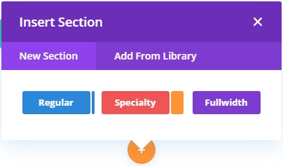
Inserting a Section
Insert either a “Regular” or “Specialty” section

Wireframe View

Full-width Layout
The “full-width” layout is typically used for hero headers, page titles, images, or custom full-width code.
Inserting a Section
Insert a “Fullwidth” section

Wireframe View

