Typography Guidelines
Emphasize
Examples:
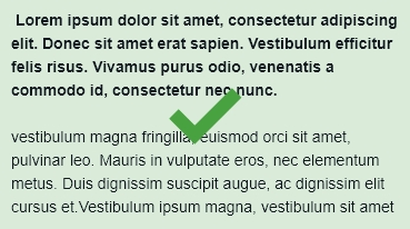
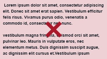
• It is acceptable to bold an introduction paragraph, but not the entire content section.


- Do not stretch fonts

• If you want to use color for a block of copy be sure that it is important.

Color
Rules
- Use colors defined by our color branding guidelines
- Do not use colors outside of our brand colors
- Be sure that the color used falls within specific logo/branding
- Example: Some of our brands only use one color while others use a variety of colors.
- Acceptable Body Copy Colors
- Black
- White over a darker background
- Acceptable shades of gray fall within tints of 30%-90%
- Use best judgement and keep readability as the highest priority
Color Combination Rules
- White font used on dark backgrounds
- Black font on Lighter colors
- Shades of gray can be used over white
- Shades of gray with a tint within 100-80% can be used with color
- Yellow and darker colors are acceptable color combinations
- Is it a darker yellow paired with a blue that is similar in saturation?
- Always consider readability
- Do not use bright yellow with white
- Check saturation of color combinations
- Color vibration is hard on the eyes and often forces the reader to look away, it happens when two colors use the same level of saturation
Underline
Don’t
Do not underline a whole section of content including headers, subheaders, body copy, etc.
Do
Underline one or two words for emphasis as directed by content writers.
Line Height
Do not space out copy to fill space
- Typography must stay within defined rules
- Exceptions include pull quotes and certain header choices which may exceed defined point sizes but visually take up the same space
Do not exceed established styles
- If a style is set to a certain point size, do not go above or below acceptable sizes.
Weight
- Don’t bold large amounts of body copy
- Do not use all caps for body copy
- Keep weight consistent in body – unless used intentionally or directed otherwise by content writers
- Heavier weights should be used for emphasis, or to indicate important content
Layout
- All content should line up either left, right or center along the same guide
- Keep an eye out for orphans and widows
- Use tracking to move them
- Stay within -20pts min/20pts max
- Keep hyphenation off
- Keep information together that belongs together
- Examples:
- Headers and subheaders will have smaller space between them
- Copy and bullet points
- Available jobs and pay rates
