Image Guidelines
User Experience
When selecting images for consumption we need to consider the user experience. What media will they be viewing the image on? Below is a list of best practices for each media type to optimize the user experience and get the most out of each image.
Web
Resizing
Consider web responsiveness when creating/selecting images for websites
- Multiple sizes should be uploaded to optimize responsive resizing.
- This should help avoid any awkward crops or content of the image being lost due to resizing the browser window/viewing on mobile devices
Copy Space
Make sure to take into account the need for copy space on website images. This will be explained further in the web standards.
- E.g. Header images should allow copy room for floating text and or buttons.

Image Specs/Requirements
Image Size
- 72ppi (pixels per inch)Set up in RGB color space
- Max file size between 200 – 250kb
- As a best practice the smaller the file can be without losing detail the better.
- JPG/PNG/GIF are all acceptable formats
- SVG is used for Google Data Studio
High-Definition Screens
- Larger images could be sized for 1200-1600 pixels wide
- The max width will be determined by the web standards guidelines
- Images should be exported in 1x/2x/3x/4x for scalability in retina screens
Scalability – focus
Take into account the detail of an image when scaling.
- It is best to avoid using overly detailed images set to 2” or less
The focus of images in print material should always lead readers towards the content/text/CTA of the print piece.
- E.g. When a person is looking a direction in the image, perhaps have them be looking a the headline or CTA
White space
This will be determined on a layout basis, sometimes images require white space surrounding them, but other times we have overlap with both text and shapes.
- Consider the end goal of using the image and make an informed decision.
Keep high contrast between colors
It is best to avoid “muddy” or low contrast images where the colors blend together. Images used in our print material should be bright and engaging rather than dull backdrops.
By using contrasting color tones in our image we can direct the reader’s focus throughout the document better.

Response from people is greater based on the authenticity of the ad/image. We want to strive to find images that tip toe the balance between amateur photography and authenticity
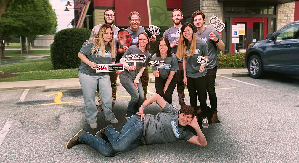
- This means looking for non-corporate feel stock photos, perhaps taking our own photos of Teammates/Ōnintes.

Bright – positive feel

As mentioned in the art direction section we aim for excitement and positivity when both representing and communicating to Teammates.
Images should be bright and engaging in both color and content. We want these images to stand out on Mobile screens as well as the web.
Text
20% rule
- As a best practice we want to limit our amount of text placed on social media images to 20% or less. Research shows this will engage people better as no one wants to read a wall of text.
- Think of it as clarifying our message

Dimensions
All images exported at 72ppi and 250k maximum file size
- 1920 x 1080px
- Set margins to 75px to avoid losing logo when Facebook crops for mobile viewing
- 1080 x 1080px
- Instagram itself will reduce the quality to 72 ppi upon upload, but it is best to set up the image at that quality beforehand.
- 1200 x 627px
- Keep the rule of thirds when laying out photos for posts
The Ōzone
- Carousel banner: 2000 x 1000px
- Keep content in upper 2/3rds of visual space and avoid using text in the image when possible
- Page banner: 1128 x 150px
- Can increase height up to 1128px as needed
- Square Img: 456 x456px
- Small Vertical Banner: 264 x 456px
