Media Guidelines
Arial is the primary font used on Ōnin and Ōnin brand websites and can be used in the defined font sizes and weights as shown below. For special cases such as hero headers or quotes, Montserrat provides a typeface that compliments Arial.
Color Management
There are 3 primary color types with print material listed below. Following are a few details and best practices for each color space.
CMYK
Cyan, Magenta, Yellow & Black
This is the primary color type for printing.
Transparencies will sometimes print okay, but it is best practice to “flatten” PDFs using adobe acrobat or inside of indesign.
RGB
Red, Green & Blue
This is the primary digital color space
Almost every image you use will be in RGB format
Best practice is to convert these to CMYK before printing.
You can also convert the colors inside Adobe acrobat before flattening.
Spot Colors
Pantone colors
These have the ability to be color matched by distributors and are the ideal format to tell a supplier our brand colors
These will need to be converted to CMYK before printing
Unless we are doing professional Offset printing
Transparencies with spot colors cause all kinds of problems and will need to be “flattened” using adobe acrobat or inside of indesign.
Output Preview
Use Acrobats Output Preview function to check what color types are in your document before printing.
This can be found under the tool “Print Production”
This will determine if any colors need to be converted and transparencies flattened.
Document Types/Print Setup
The following list contains common print document types that we will encounter here at Ōnin. The goal is to have a quick reference list of print materials we can make as well as how to setup these documents for print. We will need to make design templates for the following doc types following branding guidelines 2.0.
Flyers
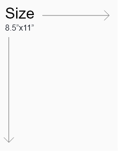
Setup
Local Print
Margins
- Keep content 0.5” from the edge, this is considered the “safe area”
- Shapes/graphics/footers may extend to 0.25” from the edge
Bleed
- No Bleeds
Pro Print
Margins
- Keep content 0.5” from the edge, this is considered the “safe area”
Bleed
- No Bleeds
- Even though full bleed is acceptable for any professional printed flyers, we should strive to stick to the local print settings to ensure printability in-house and within branches.
- Exceptions will be made to this on a case-by-case basis
Paper Type
- 24lb (B&W only, some see-through)
- 32lb (Color recommended, avoids see through color)
- Gloss Text (Fancier, thicker version of the above two, some sheen)
Postcards/Mini Flyers
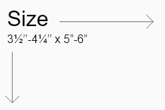
Setup – Postcard
Pro Print
These will have to be printed professionally as we cannot print at this size on our in-house printer
Margins
- 0.25” from edge
Bleed
- 0.125” standard
Paper Type
- 32lb (Color recommended, avoids see through color)
- Gloss Text (Fancier, thicker version of the above two, some sheen)
Setup – Mini Flyer
Local Print
- Set at “4-up” or 4 to a letter size page.
Pro Print
File should be sized to a single mini flyer size. The print shop will use this to lay out as many as possible to print at one time.
Margins
- 0.25” from edge
Bleed
- No bleeds for mini flyers
Paper Type
- 32lb (Color recommended, avoids see through color)
- Gloss Text (Fancier, thicker version of the above two, some sheen)
Posters
Size
Posters sizes vary. Selection will depend on the placement of the printed poster.
Local Print
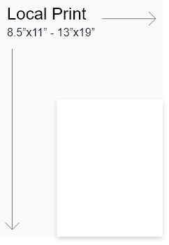
Pro print:
- 8-1/2” x 11” — Letter
- 11” x 17” — Tabloid or Ledger
- 12” x 18” — Mini-Poster
- 18” x 24” — Medium Poster
- 24” x 36” — Large Poster
- 27” x 40” — Movie Poster
- 48” x 36” — Academic Poster
- 40” x 60” — Subway Poster
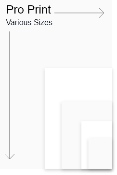
Setup
Local Print
Margins
varies by size, 0.5”min
Bleed
No bleeds are used when local printing
Pro Print
Margins
varies by size, 0.5”min
Bleed
0.125” is standard – refer to printer for exceptions
Paper Type
11” x 17” – 24lb (B&W only, some see-through)
11” x 17” 32lb – (Color, no see-through)
11” x 17” – Gloss Text (Fancier, thicker version of the above two, some sheen)
11” x 17” – 80lb (Thicker poster material)
19” x 13” – 32lb (Color, no see through)
19” x 13” – 80lb (Thicker poster material)
Bi-fold
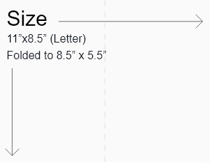
Setup
Local Print
Margins
0.5” from edge of page
Bleeds
No Bleeds
Pro Print
Margins
0.5” from edge of page
Bleeds
0.125” standard
Paper Type
32lb (Color recommended, avoids see through color)
Gloss Text (Fancier, thicker version of the above two, some sheen)
Tri-fold
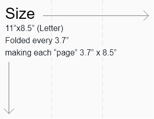
Pro Print Only
Margins
0.25” from edge of page
Bleed
0.125” standard
Business Cards
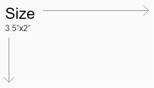
Pro Print Only
Horizontal and Vertical orientation are acceptable
Make sure to have a logo on each side of the card
Margins
0.125” from edge
0.125” standard
RFPs

Typically these are made by the accounts team, but occasionally when working on a higher profile client we will be called in to create a more styled version.
These should follow the local print guidelines and be optimized for both reading digitally and print.
Setup
Local Print Only
Margins
0.125” from edge
Bleed
0.125” standard
Yard Signs
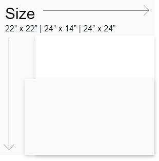
Types
No Logo
This is our preferred style of Yard sign as research shows that adding our logo to the sign increases the chance of it “disappearing”
Single Logo
If branches specifically request our logo we will use the Horizontal variant for easier readability
Co-Branded
When co-branding with a client site we will use the primary logo and follow the co-branding logo guidelines
Setup
Pro Print Only
Margins
0.375” from edge
Bleed
0.5” non standard – specific to yard signs
